
… this year it’s Ultra Violet.
This stunning shade has always brought together communities and inspired creativity and mindfulness. In 1874 a group of unknown artists met in Paris, France, to stage their first exhibition as other well known exhibition halls had rejected their art. Determined to show to their work to the public Edgar Degas, Claude Monet, Paul Cezanne and others faced much criticism at their early exhibitions.
Their new style, now known as Impressionism, was classed as unfinished and merely a sketch of a work in progress. One overriding feature of these new works was the inclusion of purples. However, this also received many scathing reviews, such as were these artists out in the fresh air too much, did they use too many drugs or are they suffering from a disease?
Since the 1870s our understanding of colours has changed. Did these early Impressionist artists use purple because they didn’t see the world with black in it as black is the ultimate absence of light? Or where they looking at the ‘true colours’? If you have sunlight depicted as yellow, the complimentary (or opposite) colour would not be black but purple, therefore shadows would be in shades of purple.
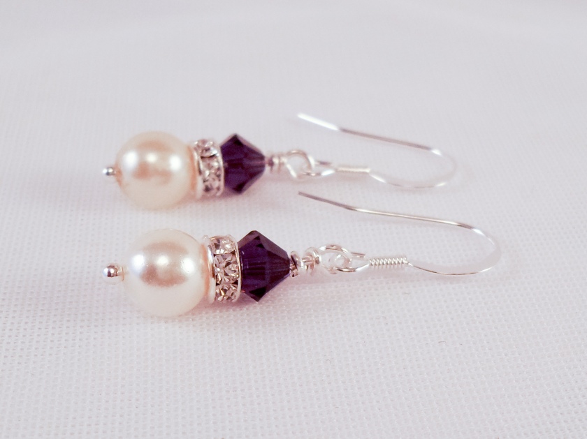
So this year if you’re redecorating your walls, buying a new lampshade, lipstick or earrings watch out for Pantone 18-3838 Ultra Violet.
The Pantone Colour Institute standardises colours globally and has a unique reference number for each shade.
To read more about colours try ‘The Secret Lives of Colour’ by Kassia StClair
